프론트엔드 개발을 배우기 위해 TailwindCSS 를 공부합니다. 실습 환경은 SvelteKit + PostCSS 을 사용합니다. 일단 감을 익히기 위해 클론코딩을 해봅니다.(1일차)
1. SvelteKit & TailwindCSS Setup
tailwindcss 확장 모듈을 설치하면 postcss 까지 설치된다. (config 설정 필요)
설치: SvelteKit + TailwindCSS
1
2
3
4
5
6
7
8
9
10
11
12
| $ npm create svelte@latest my-tailwind-app
- Sckeleton project
- Typescript syntax
- none
$ cd my-tailwind-app
$ npx svelte-add@latest tailwindcss
$ npm install # 설치
$ npm run dev # 실행
|
default font 설정
1
2
3
4
5
6
7
8
9
10
11
12
13
14
15
16
| cat <<EOF > tailwind.config.js
const defaultTheme = require('tailwindcss/defaultTheme');
/** @type {import('tailwindcss').Config} */
export default {
content: ['./src/**/*.{html,js,svelte,ts}'],
theme: {
fontFamily: {
sans: ['"Noto Sans KR"', ...defaultTheme.fontFamily.sans],
serif: ['"Noto Serif KR"', ...defaultTheme.fontFamily.serif],
mono: ['D2Coding', ...defaultTheme.fontFamily.mono],
},
},
plugins: [],
};
EOF
|
설정: svelte.config
defaults 옵션 은 deprecated 되었다. (사용 예: style: 'postcss')
1
2
3
4
5
6
| /** @type {import('@sveltejs/kit').Config} */
const config = {
preprocess: vitePreprocess({
postcss: true,
}),
}
|
전역 설정: postcss
- font 설정
- 그외 tailwind
@layer 설정 등…@apply 명령어로 tailwind 문법을 사용할 수 있다.- 일반 CSS 문법으로 클래스를 설정할 수도 있다.
1
2
3
4
5
6
7
8
9
10
11
12
13
14
15
16
17
18
19
20
21
22
23
24
25
26
27
28
29
30
31
32
33
34
35
36
37
38
39
40
41
42
43
44
45
46
| @charset "UTF-8";
/* fonts: Noto Color Emoji, Noto Sans KR, Noto Serif KR */
@import url('https://fonts.googleapis.com/css2?family=Noto+Color+Emoji&family=Noto+Sans+KR:wght@300;400;500;700&family=Noto+Serif+KR:wght@400;700&display=swap');
@import url("//cdn.jsdelivr.net/gh/wan2land/d2coding/d2coding-ligature-full.css");
@tailwind base;
@tailwind components;
@tailwind utilities;
/* || VARIABLES */
:root {
--theme-font-family-base: 'Noto Sans KR', sans;
--theme-font-family-heading: 'Noto Serif KR', serif;
}
html {
font-family: var(--theme-font-family-base);
}
@layer base {
body {
@apply bg-white dark:bg-gray-800;
}
h1 {
@apply text-2xl;
}
h2 {
@apply text-xl;
}
}
@layer components {
.btn-blue {
@apply bg-blue-500 hover:bg-blue-700 text-white font-bold py-2 px-4 rounded;
}
}
@layer utilities {
.filter-none {
filter: none;
}
.filter-grayscale {
filter: grayscale(100%);
}
}
|
- 설명에는
postcss-import 가 있는데, 없어도 되더라.- Svelte 의 TailwindCSS 설정에서 이미 설정되었기 때문인듯 (추측)
Nesting 플러그인 설치
1
| $ npm -D install @tailwindcss/nesting
|
postcss.config 설정
1
2
3
4
5
6
7
8
9
10
11
12
13
14
| const tailwindcss = require('tailwindcss');
const autoprefixer = require('autoprefixer');
const config = {
plugins: [
require('@tailwindcss/nesting'), // <-- 추가
//Some plugins, like tailwindcss/nesting, need to run before Tailwind,
tailwindcss(),
//But others, like autoprefixer, need to run after,
autoprefixer,
],
};
module.exports = config;
|
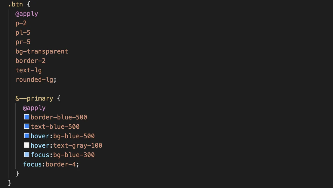
사용 사례
![tailwindcss nesting classes example]() tailwindcss nesting classes example
tailwindcss nesting classes example
1
| <button class="btn btn--primary">Primary</button>
|
2. Instagram UI 따라하기
출처: Tailwind Labs - Rebuilding the Instagram Stories UI with Tailwind CSS
![Clone Coding = Instagram UI tutorial]() Clone Coding = Instagram UI tutorial
Clone Coding = Instagram UI tutorial
1) +layout.svelte
1
2
3
4
5
6
7
| <script>
import '/src/app.postcss';
</script>
<div class="max-w-2xl mx-auto p-8">
<slot />
</div>
|
2) +page.svelte
페이지 타이틀
1
2
3
| <svelte:head>
<title>CloneCoding: Instagram UI</title>
</svelte:head>
|
상단 타이틀
1
2
| <h2 class="sm:text-lg sm:leading-snug font-semibold tracking-wide uppercase text-blue-600 mb-3">introducing...</h2>
<p class="text-5xl lg:text-6xl leading-none font-extrabold text-gray-900">Tailwind Stroies</p>
|
프로파일 리스트 및 아이템
li 항목을 4개 만들면 상단 그림과 같은 화면이 나온다.
1
2
3
4
5
6
7
8
9
10
| <ul class="mt-8 flex space-x-6">
<li class="flex flex-col items-center space-y-1">
<div class="relative bg-gradient-to-tr from-yellow-400 to-fuchsia-600 p-1 rounded-full">
<a class="block bg-white p-1 rounded-full transform transition hover:-rotate-6" href={undefined}>
<img class="h-24 w-24 rounded-full" src="https://placekitten.com/200/200" alt="cute kitty" />
</a>
<button class="create-story">+</button>
</div>
<a href={undefined}>you</a>
</li>
|
3) classes 설정
- 복잡한 tailwind 설정을 class 로 따로 등록하여 재사용 할 수 있다.
- sveltekit preprocess 에서 postcss 사용 설정을 해 두어야 함
1
2
3
4
5
6
7
| <button class="create-story">+</button>
<style lang="postcss">
.create-story {
@apply absolute bottom-0 right-1 bg-blue-500 h-8 w-8 rounded-full text-white text-2xl font-semibold border-4 border-white flex justify-center items-center hover:bg-blue-700;
}
</style>
|
3. Grid 레이아웃 따라하기
출처: Anna Blok - Making Website Using Tailwind CSS (No CSS Used)
![Clone Coding = Website with Grid Layout]() Clone Coding = Grid layout website
Clone Coding = Grid layout website
1) +layout.svelte
1
2
3
4
5
6
7
| <script>
import '/src/app.postcss';
</script>
<div class="container mx-auto px-4">
<slot />
</div>
|
2) +page.svelte
상단 헤더
1
2
3
4
5
6
7
8
| <header class="flex justify-between text-2xl py-8 border-b-2 border-blue-100 mb-8">
<a class="w-3/5" href="/">SvelteKit</a>
<ul class="flex w-2/5 justify-between">
<li><a href={undefined}>About</a></li>
<li class="ml-8"><a href={undefined}>Blog</a></li>
<li class="ml-8"><a href={undefined}>Contact</a></li>
</ul>
</header>
|
그리드 레이아웃
1
2
3
4
5
6
| <div class="grid grid-cols-3 gap-4 text-center">
<div class="hover:bg-blue-400 transition duration-500 ease-in-out bg-blue-100 p-8 rounded-md">1</div>
<div class="hover:bg-blue-400 transition duration-500 ease-in-out bg-blue-100 p-8 rounded-md">2</div>
<div class="hover:bg-blue-400 transition duration-500 ease-in-out bg-blue-100 p-8 rounded-md">3</div>
<!-- ... 총 9개 -->
</div>
|
1
2
3
4
5
6
7
8
9
10
11
12
13
14
15
16
17
18
19
20
21
22
| <div class="bg-blue-100 rounded-md p-8">
<h2 class="text-lg mb-4">Subscribe Me</h2>
<form action="" class="flex text-lg -m-2 w-full">
<input
class="m-2 border-2 border-blue-400 rounded-md placeholder-blue-400 px-8 py-4 w-2/5"
type="text"
name=""
id=""
placeholder="Your Name"
/>
<input
class="m-2 border-2 border-blue-400 rounded-md placeholder-blue-400 px-8 py-4 w-2/5"
type="email"
name=""
id=""
placeholder="Your Email"
/>
<button class="bg-blue-400 border-2 border-blue-400 rounded-md px-8 py-4 text-white m-2 w-1/5" type="submit"
>Subscribe</button
>
</form>
</div>
|
9. Review
- 두려움이 있었는데, 해보니깐 생각보다 할만하다는 느낌이 든다.
- 현타가 오기 전까진 클론 코딩이 자신감 형성에 도움될듯
 tailwindcss nesting classes example
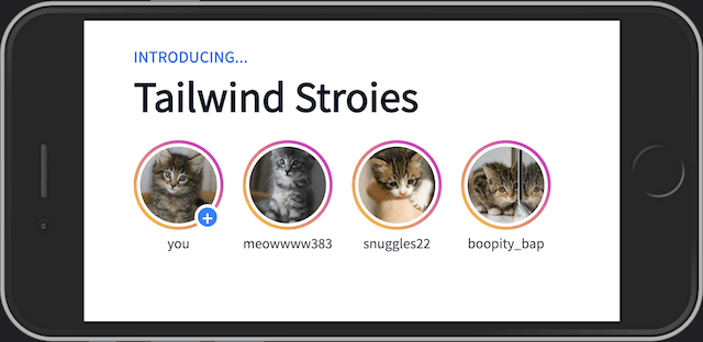 Clone Coding = Instagram UI tutorial
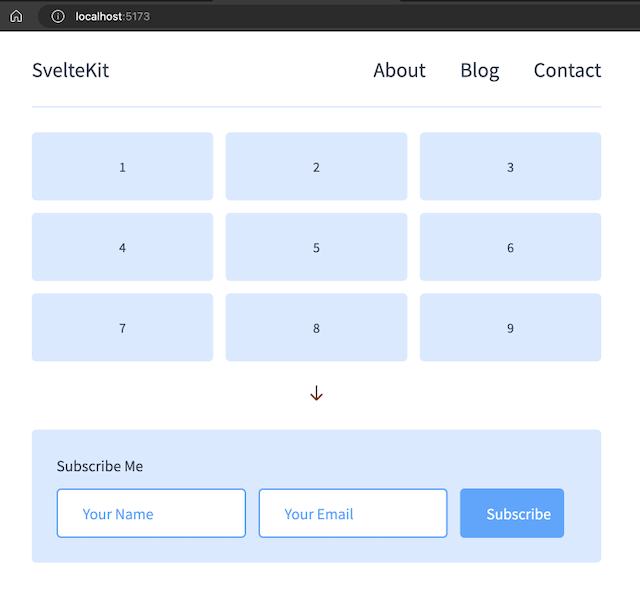 Clone Coding = Grid layout website